NVMBR
A gallery-paced online store for NVMBR’s SS26 menswear collection, “Shelter House On The Hill”: handcrafted in India, sold to the world.
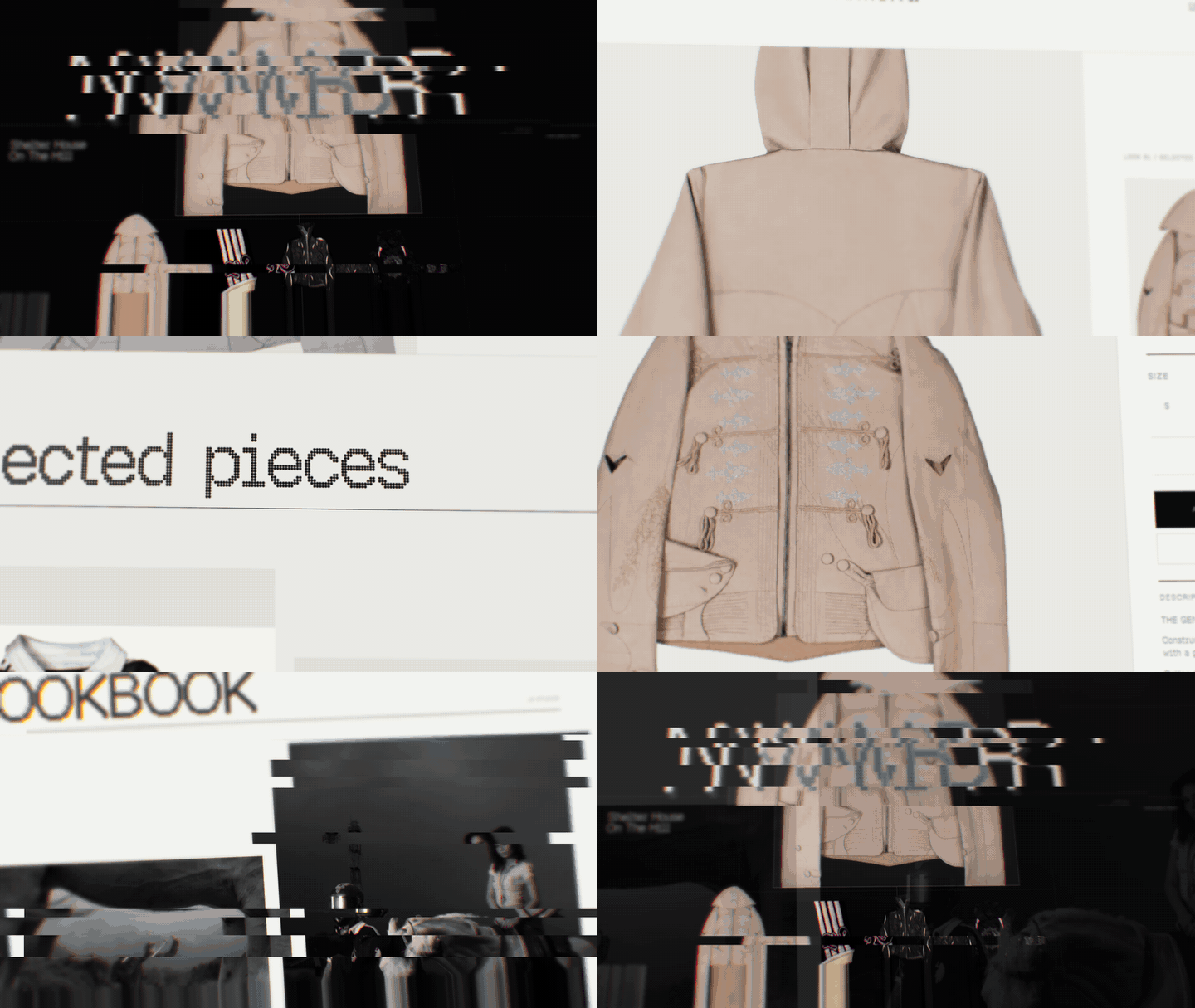
01 — Context
NVMBR is a contemporary menswear label from India, built by designer Adith Gandhi. Each piece is handcrafted: tailoring, kantha, zardozi and hand-finished surfaces that take days to make. The SS26 collection, “Shelter House On The Hill”, examines form, surface and movement across four objects.
The label sells to customers in India and abroad, so the store had to carry a garment-first, editorial mood and still work as a serious multi-currency shop.
02 — The challenge
Most streetwear stores look the same: a grid of products, a sale banner, a pop-up. NVMBR makes very few pieces, so the site had to slow people down and make each garment feel considered, then make buying it effortless.
The brief: present a single collection like an exhibition, keep the product one tap away at every point, and support pricing and shipping for a global audience from day one.
03 — Direction
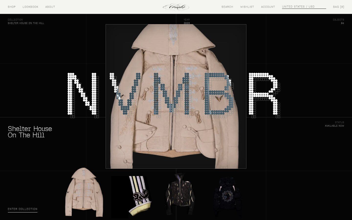
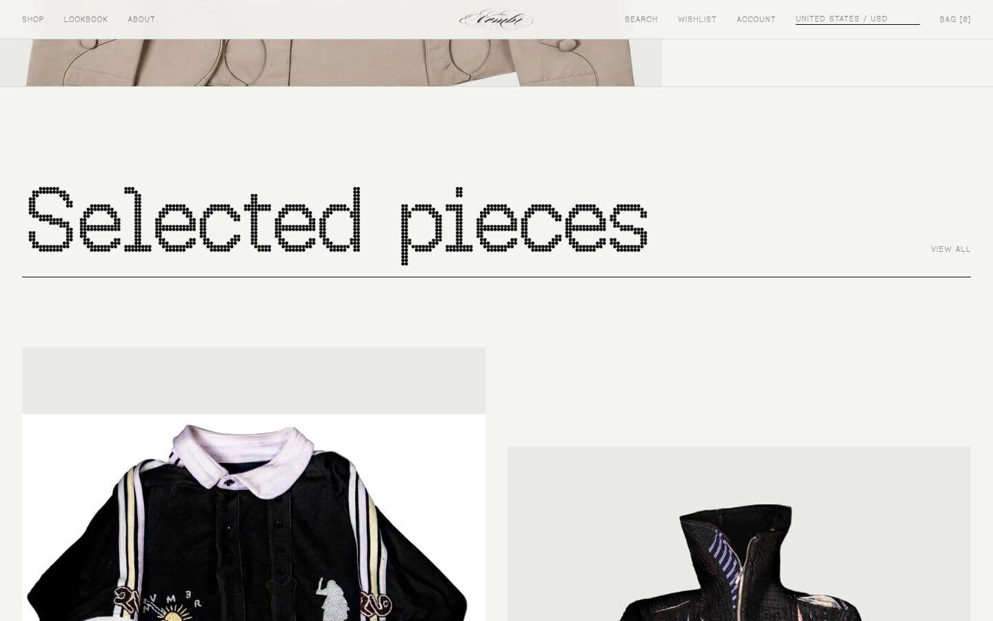
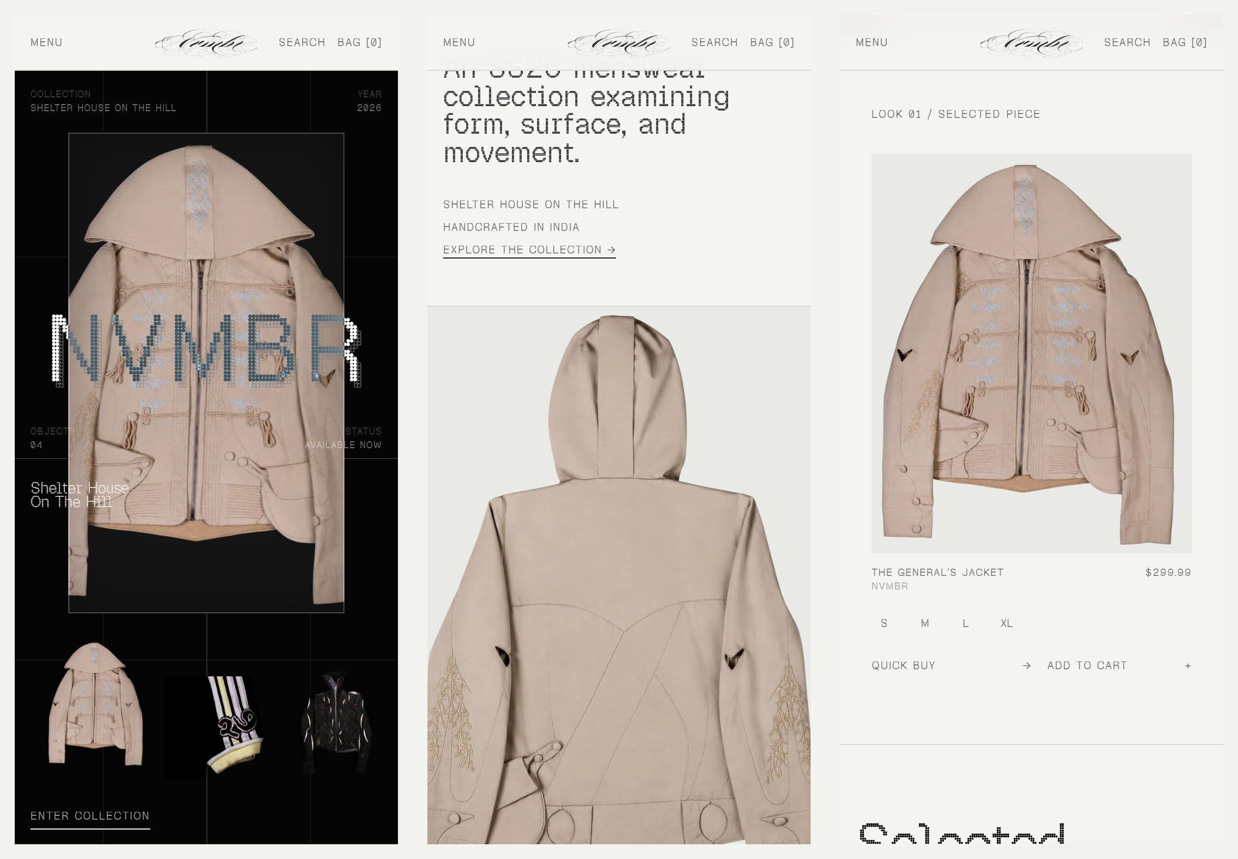
We treated the homepage like a gallery wall. The hero reads as an exhibition label: Collection, Year, Objects, Status. A monospaced typeface and a warm off-white ground keep the interface quiet, so the garments carry the colour and texture.
Navigation is reduced to Shop, Lookbook and About, with currency, wishlist, account and bag tucked into a single utility row.
04 — Designing the shopping flow
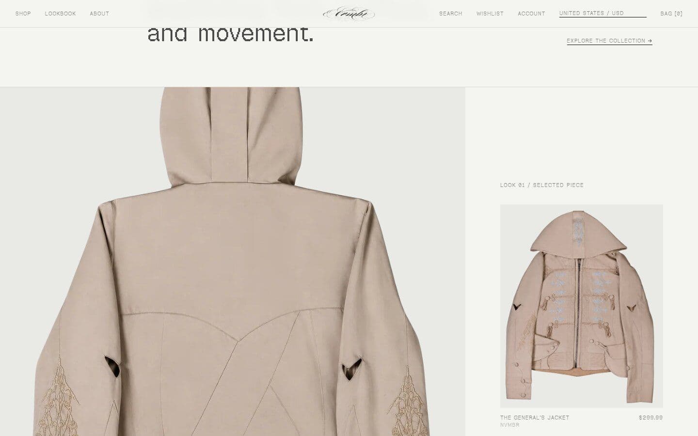
Every featured piece is shoppable in place. Hover reveals size options with Quick Buy and Add to Cart, so a customer can go from first impression to bag without leaving the story.
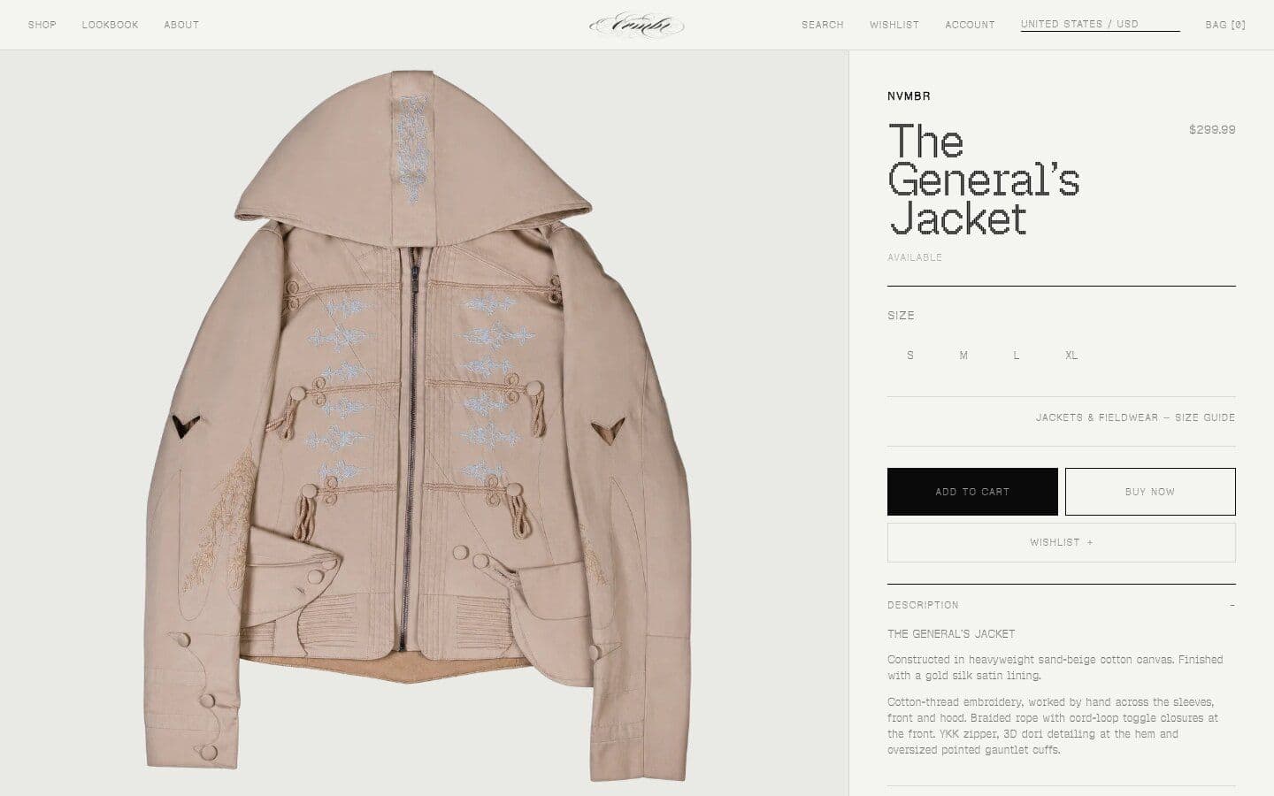
Product pages lead with large garment photography and keep size, price and add-to-bag above the fold, with the size guide, shipping and returns one click away.
05 — Built for a global audience
The store prices in nine currencies (INR, USD, GBP, EUR, AED, CAD, AUD, JPY, SGD) from one switcher in the header. Shipping, returns, size guide, FAQ and legal pages share one template, so the team can update policies without design help.
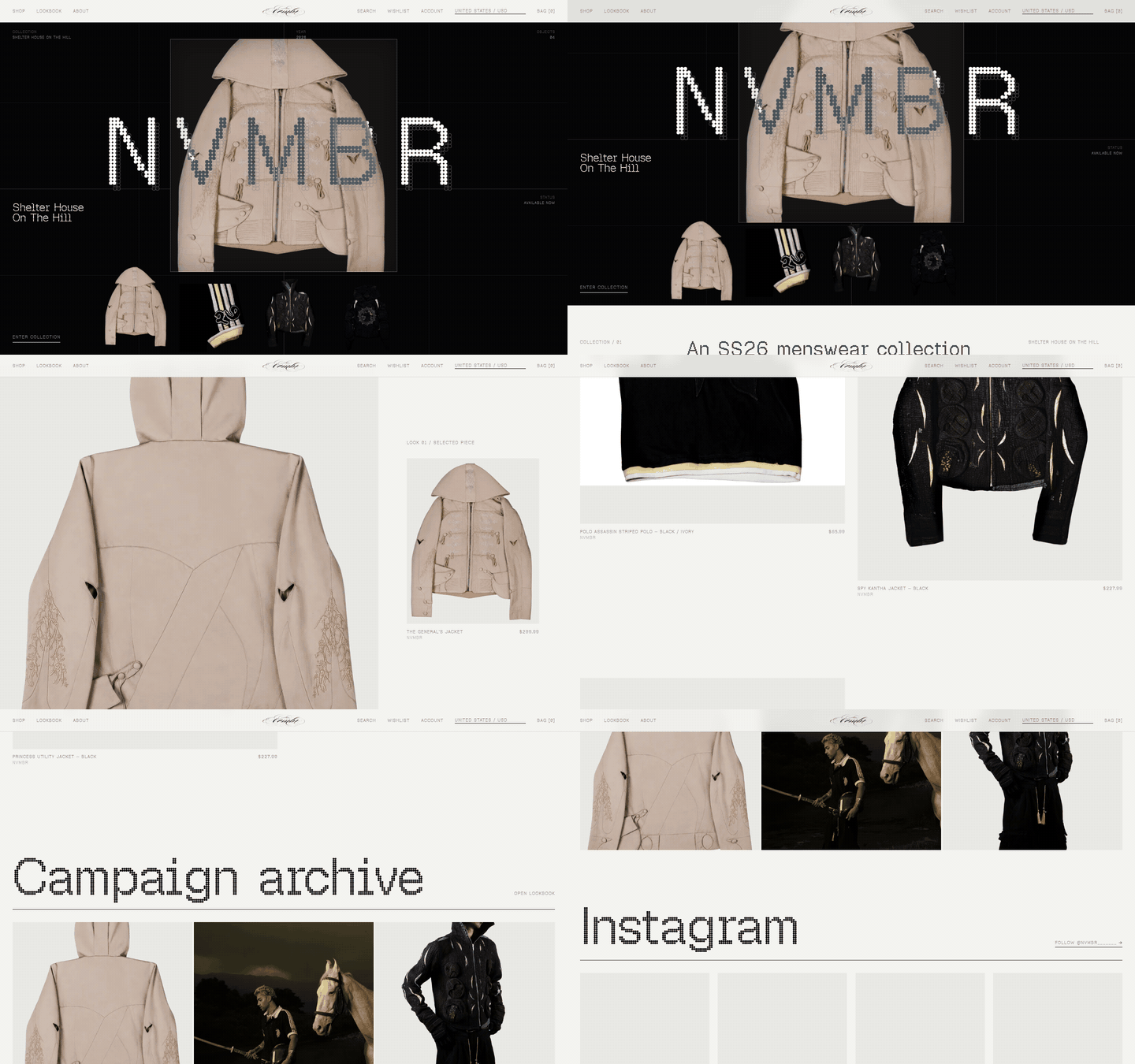
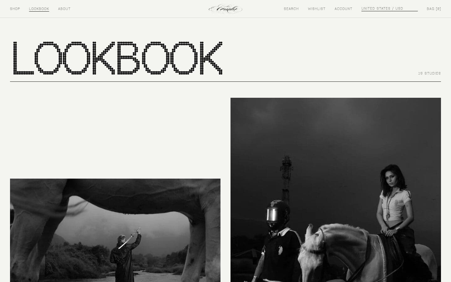
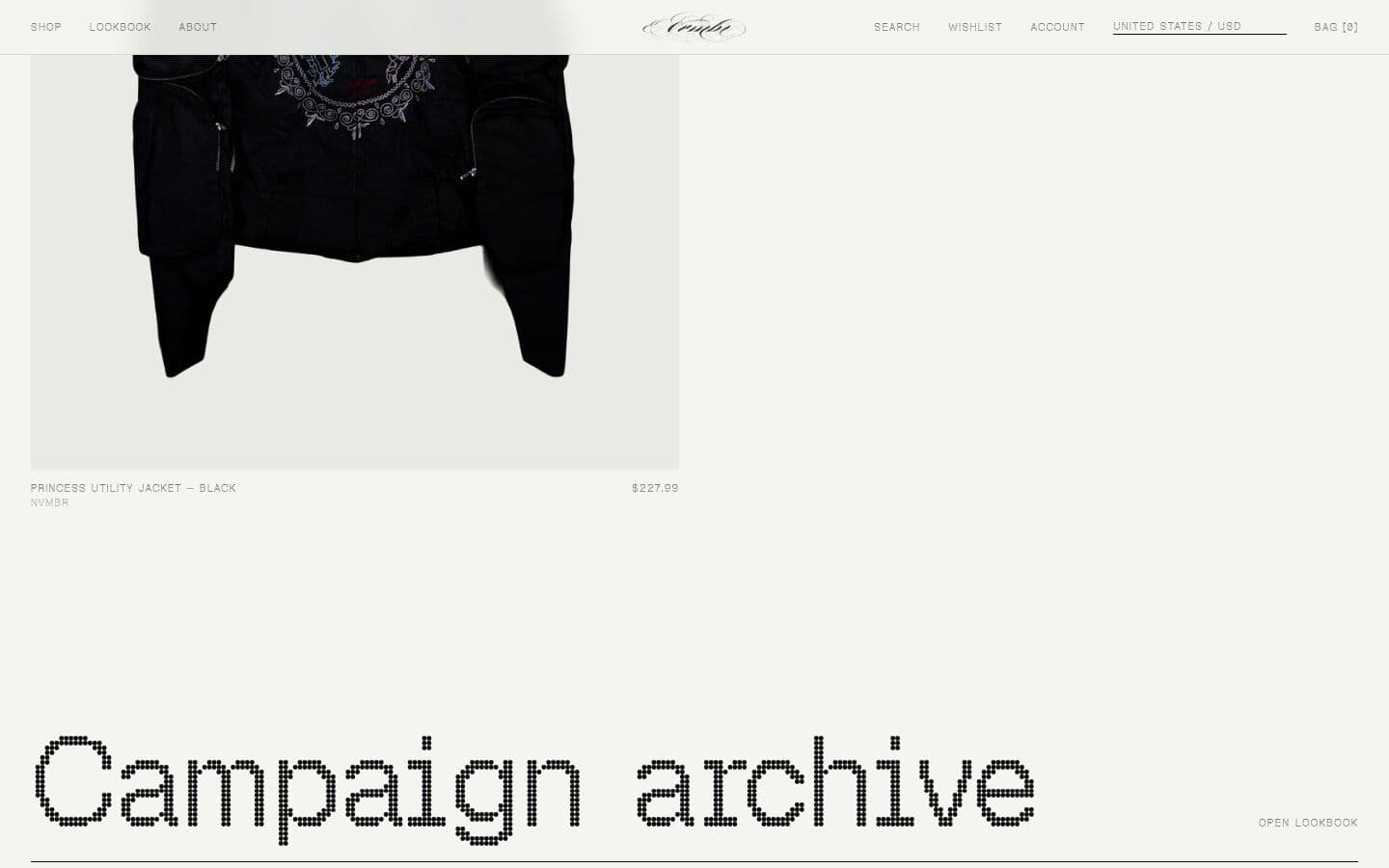
The lookbook sits beside the shop as a campaign archive, and an Instagram strip links each campaign study back to the label’s feed.
06 — Mobile
Much of the label’s audience finds it through Instagram, on a phone. The mobile layout stacks each look full-width, keeps the bag reachable at all times, and turns size selection into large thumb-friendly buttons.
07 — The result
A store that feels like the collection: slow, tactile and precise, with a checkout path that is never more than a tap away. The system is built to take the next collection by swapping the hero, the four objects and the lookbook.
Credits
Client: Adith Gandhi, NVMBR
Design & development: Diyuksh Rajpurohit